Chart Widget
Chart widget will enable users to create customized charts using their own data to create insightful visualizations.
To Add a Chart Widget in the dashboard, follow the steps below:-
- Go To Dashboard Section From Top-Left Hamburger Menu.
- Find Horizontal Menu at the bottom of the Grid, Click on Create Icon.
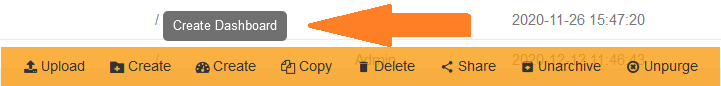
- The Create Dashboard Dialog box will Pop on the screen like:
6.PNG)
- Enter Name and Click on Create Button.
-
Click on
7.PNG) the Edit Dashboard icon from the top right corner menu, a list of the available component will open up as follows:
the Edit Dashboard icon from the top right corner menu, a list of the available component will open up as follows:
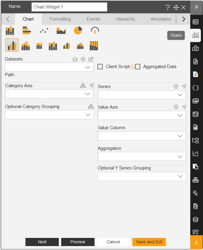
- Click on Chart
 component from the widget panel of the dashboard, a configuration box would open as follows:
 - As seen in the above figure, the AIV application enables the user to create a variety of charts such as column, bar, area, line, pie as well as advanced charts such as funnel, pyramid, radar, candlestick, OHLC, variable radar and column chart with scroll.
- Select the type of chart you want to use and select datasets from the drop-down menu.
- For our example we will be working with column Chart and will use Sales.cds as dataset.
- After selecting the dataset, then the user can select among the options in the Category(X) Axis like for example we have selected country in the category axis control in the below figure.
- Then in the value column , user can select a suitable option like we have selected QuantityOrdered.
- Then user can select the suitable option in the aggregation.
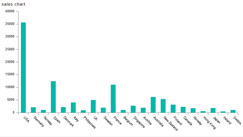
- Click on preview and save and Exit and the chart will appear as shown in the figure below: