Hierarchy tab in the Chart Widget
Hierarchy - This function enables the user to create a dynamic view of the data, as the user will drill in each level a new information will be displayed in a different view on clicking on a data point.
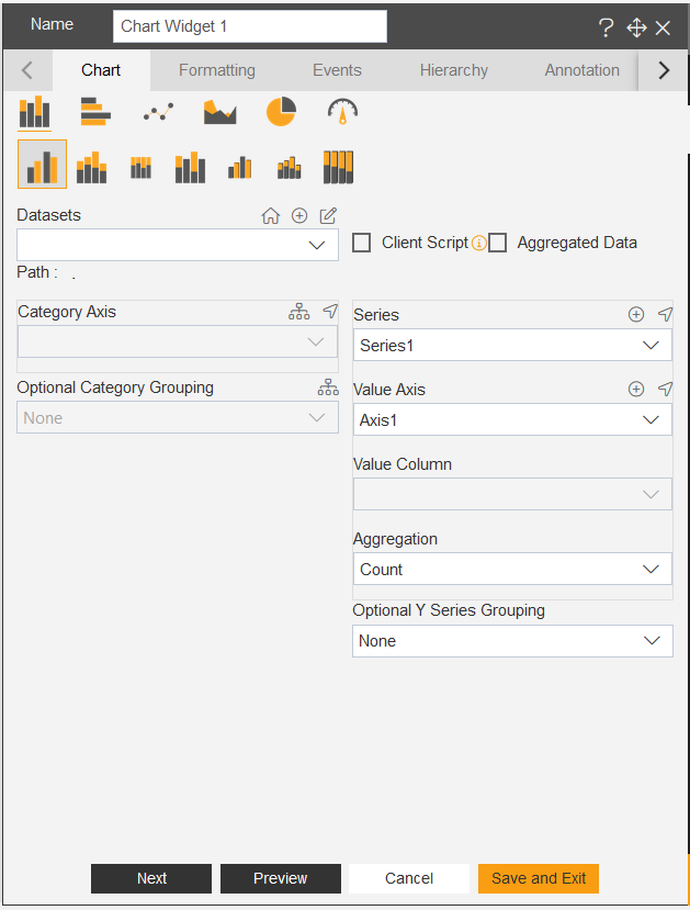
1. For creating the chart click on the chart icon in the widget panel, now an edit box will openup where you can select any chart pattern, Example: Here we are selecting the column chart
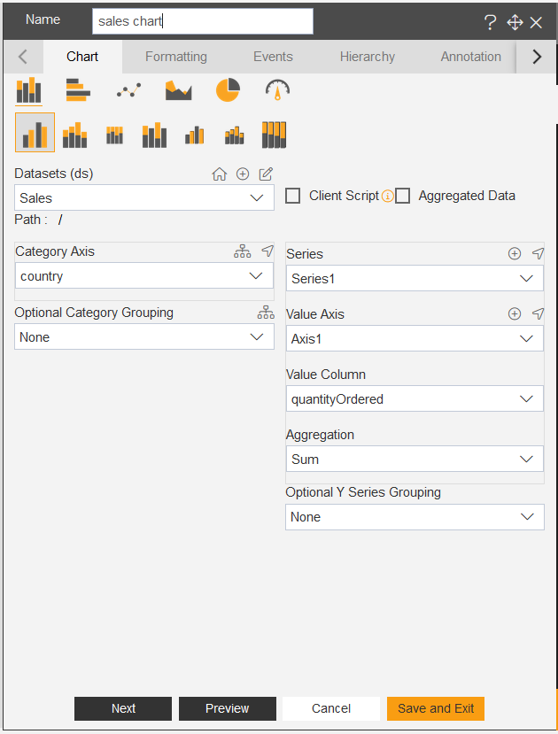
Dataset: Sales.DS,
Category Axis: country,
and Value Axis: Quantityordered.
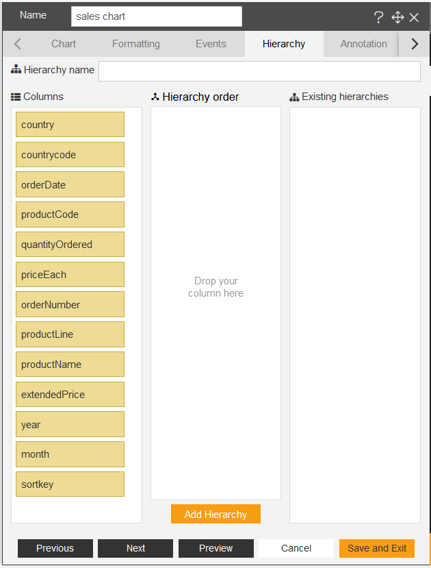
2. To add hierarchy in the chart, user can click on hierarchy tab and once hierarchy tab is clicked, the options will appear as shown in figure below:
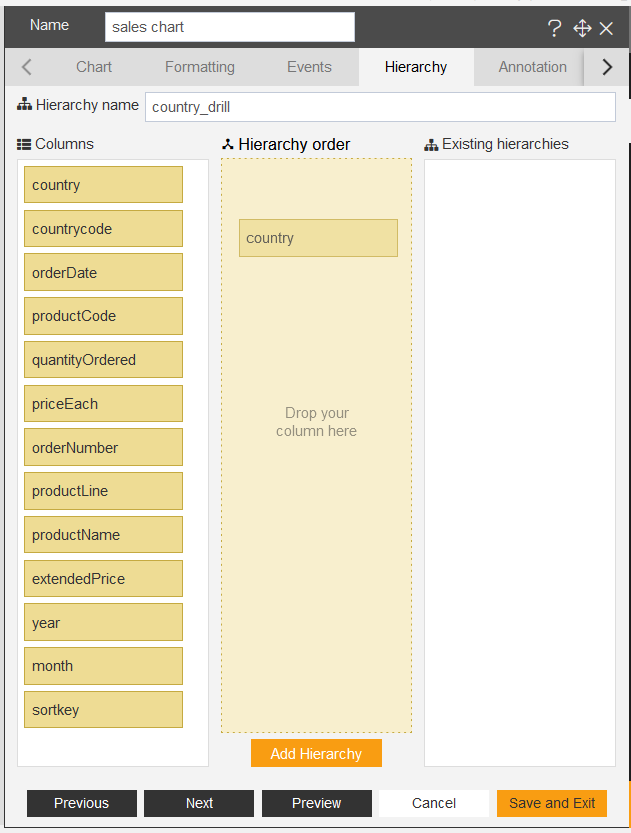
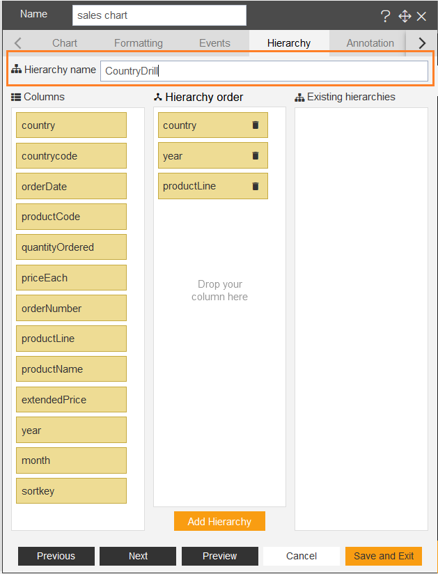
3. User can give a suitable name to the hierarchy as shown in the figure below and can drag and drop datacolumns in the hierarchy order. as shown in figure below:
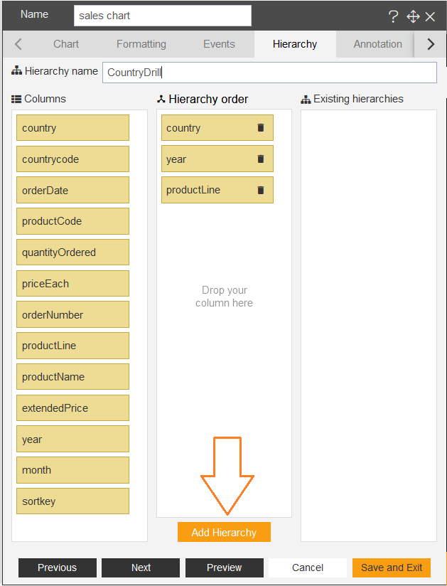
4. After adding the datacolumns in the hierarchy order, user can click on the Add Hierachy button in the bottom, as shown in the figure below:
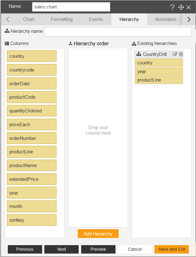
5. Once the user clicks on the Add Hierarchy button the data columns get added under the Existing hierarchies from the Hierarchy order, as shown in the figure below:
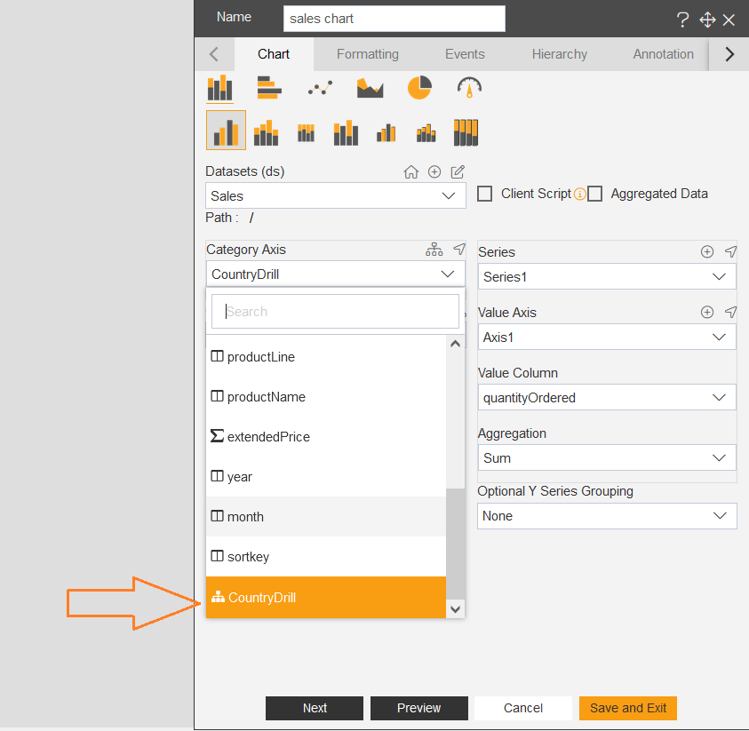
6. Once the hierarchy has been added, user can go back to the chart tab and instead of country select CountryDrill from the dropdown in the CategoryAxis option.
7. Now click on Save and Exit button and go to preview mode.
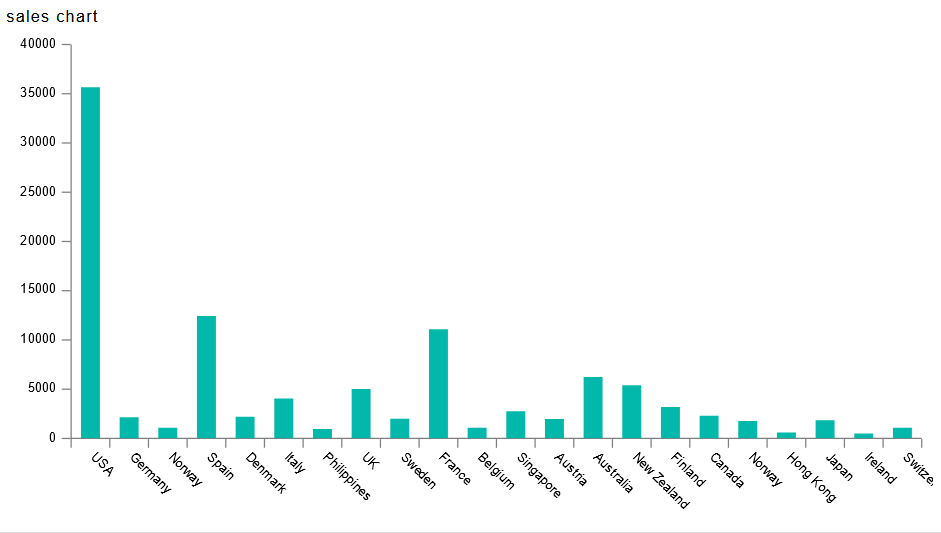
8. Once the user will click on any of the bar in the chart, the user will be able to view the dynamic data of that particular country as shown in the figure below:
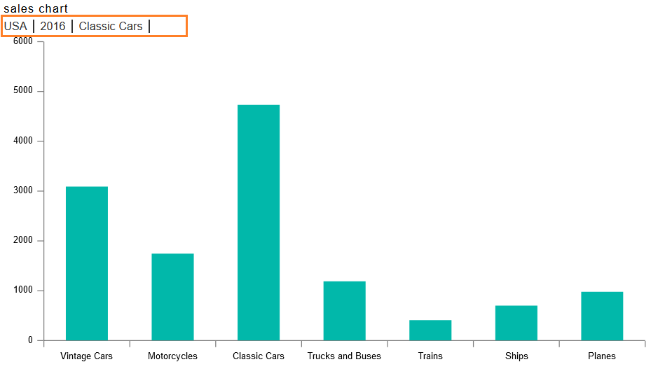
9. Once the user drills into the chart, all the stages will appear on the top-left corner of the chart, as shown in the above figure.