Dashboard Match Global Color
This document contains information on a feature Match Global Colors. Globle colors are
defined at the dashboard level. When we enable Match Global color it will take color from
the colors List of Dashboard Global Theme in Dashboard setting.
Use Case: This feature is useful when user wants a specific list of colors for selected
widgets in dashboard. For example, user has his own list of colors that he will be using for
the most of the widgets in dashboard. In AIV, it is possible to apply custom list of colors
from Color & Theme Property. But going to this setting and apply custom colors for each
widget is time consuming. To make this process simple and faster, we provided a setting that
is defined at dashboard level and user can easily select to apply it in selected widget or
not. In dashboard setting, there is one option called Dashboard Global theme. User has to
apply custom list of colors and once applied he can use these colors in each widget by using
one toggle button. This button is available inside Color & Theme Property of widget called
Match global colors. By turning on this setting, widget will take colors from Dashboard
Global theme.
In this Scenario we are using Two Stacked Chart widget with two different Dataset. We can
enable the Optional Grouping color in Formatting >> General Property >> Color & Theme
Property. When we enable Match Global color in both the widgets, it will take same color in
both the widgets with same Country.
1. Click on the Hamburger icon.
2. Create dashboard box will be shown on the screen. Users can create a dashboard by
clicking on the + icon.
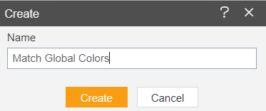
3. Users can set the dashboard name as per their requirements. Click on create button after
entering the dashboard name in the dialog box. As shown in the below image.
4. Users will see an empty Dashboard, as shown in the image below:

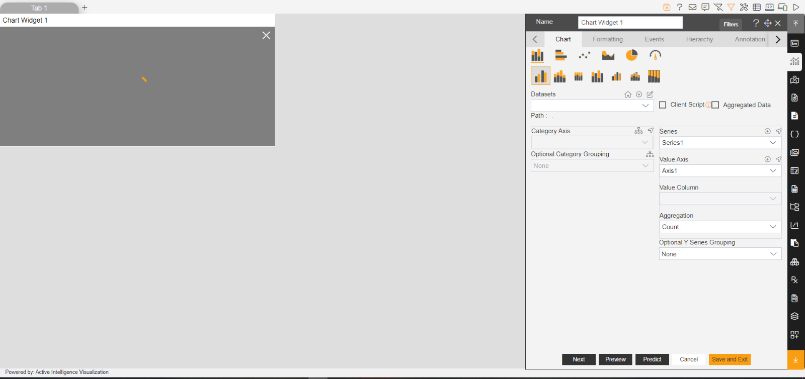
5. From the right vertical menu select the chart widget icon.
6. The Edit menu box appears as you click on the Chart icon. And a widget gets added in
content place automatically in the dashboard. As shown in the below image.
7. Enter the following details in the edit menu of the Column Stacked chart:
Name: Sales by Month
Dataset: Sales.ds
Category Axis: month
Value Column: extendedPrice
Aggregation: sum
Optional Y Series Grouping: Country

8. Go to Edit Menu Formatting tab >> General Property >> Color & Theme Property.
Theme: Select Dark from the dropdown
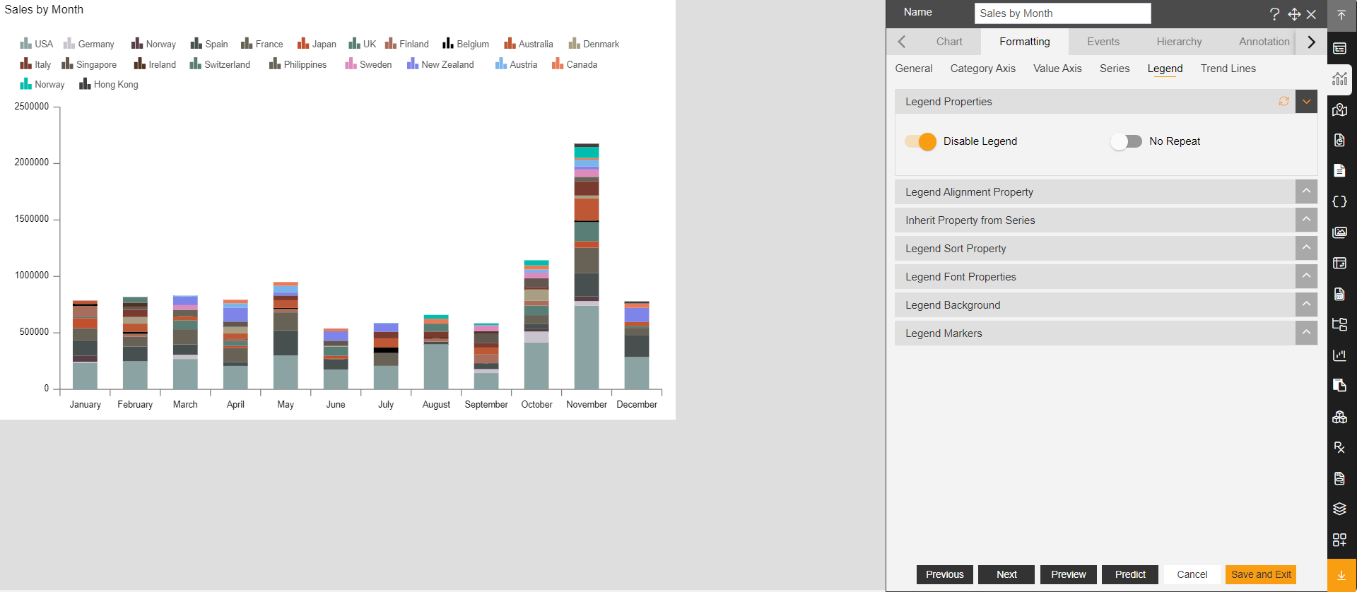
9. Then go to Legend >> Legend properties >> Enable Legend button, As shown in figure below:
10. Go to Widget Setting Property >> Title Properties.
11. Make changes as per below: Title Move To: Center (select from dropdown)
12. Click on Preview & Save and Exit.
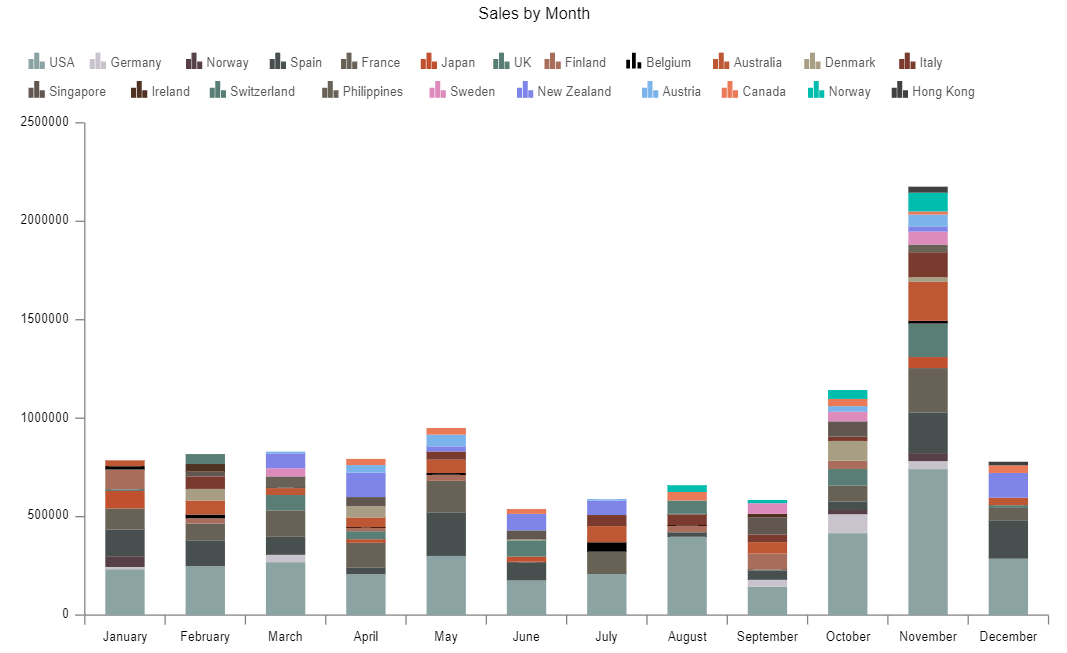
13. Your widget will look as per the image below:
14. Go to Formatting tab >> General Property >> Chart Scrollbar Property.
Value Scrollbar: select Scrollbar from the dropdown
15. Click on Preview and Save & Exit.
16. Add another chart by clicking on the chart icon.
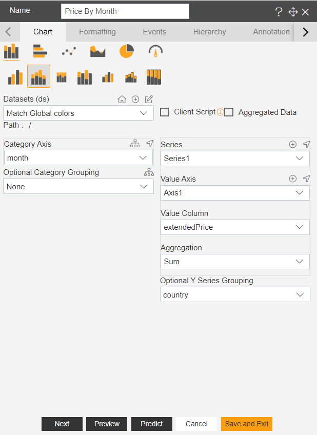
17. In Edit menu enter the following details:
Select Column Stacked Chart
Name: Price By month
Dataset: Match Global color
Category Axis: month
Value Axis: extendedPrice
Aggregation: Sum
Optional Y Series Grouping: Country
18. Go to Edit Menu Formatting >> General Property >> Color & Theme Property
Theme: select Kelly from the dropdown
19. In Chart Scrollbar Properties >> Value scrollbar >> select Scrollbar from the dropdown.
20. Go to the Legend >> Legend Property >> Enable Legend button.
21. Go to Widget Setting Property >> Title Properties & Make changes as per below:
Title Move To: Center (select from dropdown)
22. Click on Preview and Save & Exit.
23. The widget will look as per the image below:
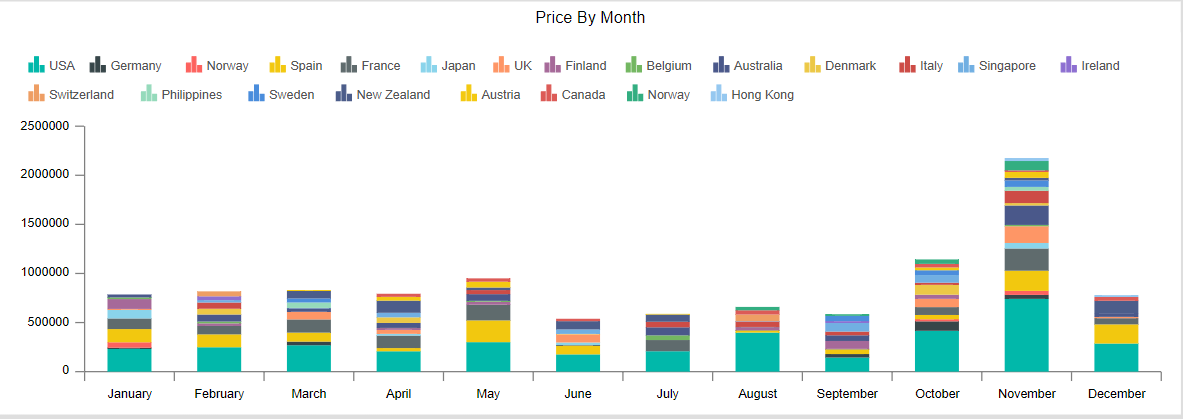
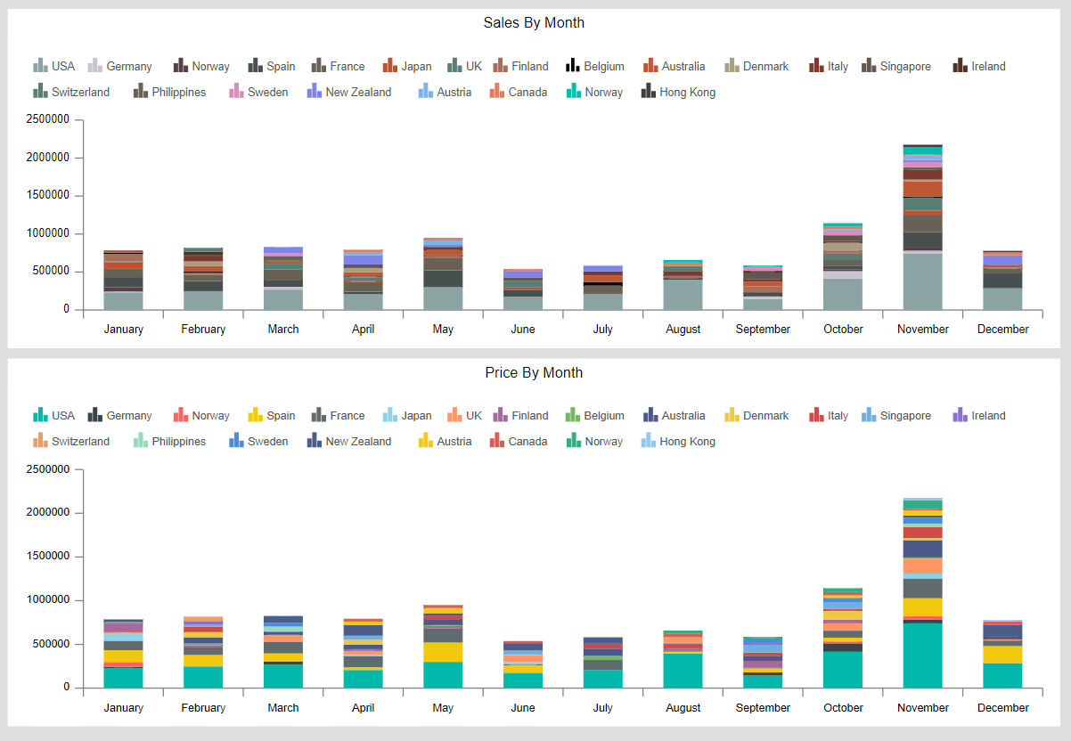
24. Now the user can see that both chart color of country USA is different as per the theme
applied, as shown in figure below:
25. Now go to the Dashboard Settings (from top right corner of the dashboard) >> Dashboard
Global Theme.

26. Click on icon  after Color List & the user is able to see as per the image below:

27. Go to the Edit Menu of Sales By month chart >> Formatting Property >> Color & Theme
Property.
Toggle the Match Global Color button.

28. Follow the same process for Price By month widget to Enable Match Global Color button.
29. Click on Preview and Save and Exit.
30. Click on preview from top right corner of the dashboard.
31. And your screen will look as per the image below:

32. Select first 3 months (January, February, March) from the category axis of the both
widgets.
33. Adjust the scrollbar from value axis, your widgets will look as per the image below:
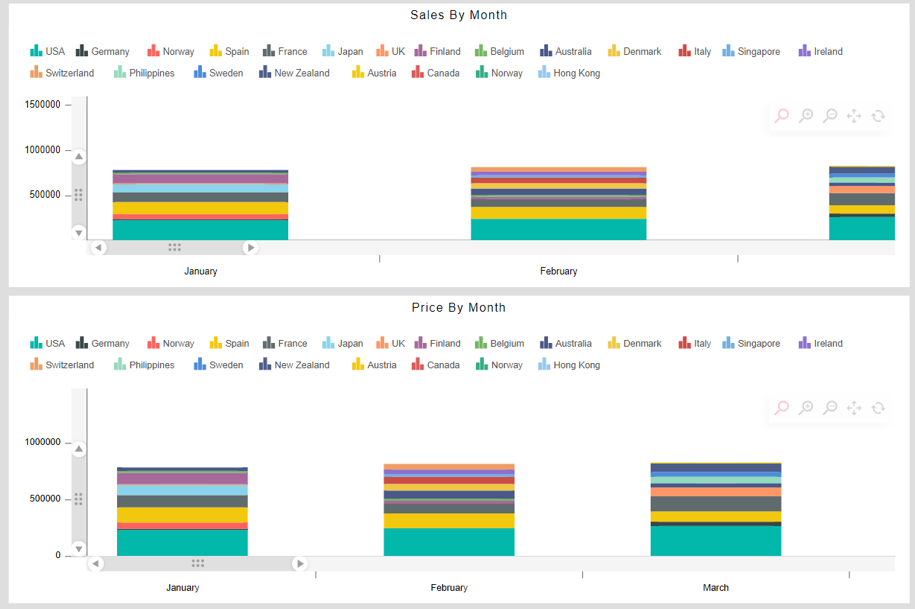
34. User can see that both country USA has same color.
35. Click on reset button for both of the widgets as shown in the image below:

